Friday, August 24, 2012

A Desert Makeover: Phoenix Coyotes

Hello again everyone! Sorry for another late night post but this is about all I can do for now. Tonight I have a few Coyotes concepts; one from me and one from Tyler G. Also if you didn't see earlier, the Round 1 votes for the Expansion Contest were  announced and Round 2 voting has begun. Lastly I'm going to try (no promises) to get a big post up. That would include concepts, lots of concepts, news, updates, etc. But ;et's get to tonight's' concepts.

Phoenix Coyotes

The Coyotes current look isn't terrible but it could definitely use some work. What I don't like about Phoenix's jerseys is that they went from very unique, creative jerseys to a completely bland design. What I wanted to do here was create another unique, desert look without it looking too gaudy. I used the Aztec motif but kept it clean and not too crazy. What do you think? Any C&C is appreciated!

Phoenix Coyotes (Tyler G.)
Rather than creating a new design for the Yotes, Tyler updates the current one. Finally someone added the hem stripes! I though I was the only one who got irritated by their absence? The rest of the jersey looks good and would be an excellent update for the Coyotes. My favorite part has to be the stripes on the collar. However I don't like the nickname on the helmet. If I had to fix one thing though, I would change all of the white to tan. Just my opinion though.

Thanks for reading, everyone. Have an excellent weekend!

Round 1 Results: Round 2 Voting Begins!

Hello everyone! Once again I want to apologize for the lack of posts and updates recently. I've been incredibly busy and haven't had much free time. Today (only 3 days late) I have the results of Round 1 of the Expansion contest! I would also like to thank everyone that participated or voted in the contest.
Note: If you do not see your name listed that unfortunately means you didn't receive any  votes. Thanks for participating, though!
_________________________________________________________________________________

Hamilton, Ontario (CANADA)

Name/Number of Votes
Justin C.                  4
Steven G.                3
Scott D.                   1

The Hamilton vote ended up with my Tigers concept just barely beating Steven G's concept by one vote. That means that my Hamilton concept will go on to face the Quebec winner in Round 2.  Here is my winning entry.
_________________________________________________________________________________

Hartford, CT (USA)

Name/Number of Votes
Scott D.                   6
Ricky M.                 1
Casey R.                  1

Scott D's Whalers concept absolutely dominated the Hartford vote earning 6 of 8 votes! Congrats Scott! His entry can be seen below will go on to face the winning Seattle concept.

_________________________________________________________________________________

Quebec (CANADA)

Name/Number of Votes
Dave C.                   4
Tyler G.                   2
NB14                       1
Ricky M.                  1

The Quebec vote was a little closer but Dave C's Nordiques concept pulled ahead and won it by a small margin. His concept will face my Hamilton entry in Round 2 for a spot in the finals. Here's his winning entry.

_________________________________________________________________________________

Seattle, WA (USA)

Name/Number of Votes
Ryan H.                   4
Justin C.                  3
Ricky M.                 1


Another close race. Ryan H, of HJC, and his Seattle Metros concept beat out my concept by one vote! His winning entry will now go on to face Scott D's Hartford concept in Round 2. Here's another look at Ryan's entry.
_________________________________________________________________________________

Round 2 Voting

Vote for your favorite concept from each country.

USA
Ryan H. - Seattle Metros
vs
Scott D. - Hartford Whalers

Canada
Dave C. - Quebec Nordiques
vs
Justin C.(Myself) - Hamilton Tigers


All votes are due by Midnight Monday August 27th. You can vote for yourself!
_________________________________________________________________________________


Friday, August 17, 2012

Last Expansion Entries: Voting Begins!

Hello everyone, it's been a little while! First off I want to apologize for the lack of updates, posts and email replies lately. I've gotten super busy over the last week or so and I don't think that will change anytime soon. Luckily I finally found enough time to sit down and write up this post. This one will just be dedicated to getting the voting process started for the expansion contest but on Sunday or Monday I should have a regular post up including some concepts and news.
_________________________________________________________________________________

In the end we ended up with 17 total entries from 9 designers. Wow! That's not a ton but it's a lot more than I expected. Thank you to everyone who participated! Here is the final entry two entries. NB14 sent in his a while ago but I forgot to post it. Sorry, NB14! If I forgot to post anyone else's or get them in the Photobucket album just let me know.

Also, I've added a prize for the contest! Nothing big but I wanted to reward and thank the winner somehow. I will dedicate an entire post to the winner and their designs. The post can feature as many designs as you want and I can include write ups on each of them as well. It's not much but it's better than nothing. 

Hamilton (Steven G.)

Quebec (NB14)

_________________________________________________________________________________

For the first round of voting you will need to vote for your favorite concept from each of the four cities. Only vote for one concept from each city and you can vote for up to two (2) of your own entries. You can send your votes to jncox9@gmail.com by Tuesday August 21 at 12PM mtn. time. 


For now you'll just have to access the entries and voting info from this page. I will be out of town this weekend but when I get back I'll add some more info the the Contests page as well as an updated bracket.
_________________________________________________________________________________

Have a great weekend everybody! Be sure to get your votes cast and come back Sunday night or Monday for the next post!


Sunday, August 12, 2012

Contributor Concepts and Expansion Entries

Hello again everyone. Sorry this is another late post but I've had a busy weekend. I just got back from Denver a little while ago and then got caught up in the closing ceremonies. Anyways.. today I've got both concepts and expansion entries from Casey R., David C. and Tyler G.

I also wanted to let everyone know that starting tomorrow my schedule will get extremely busy. I still plan on making concepts and running the site but my time to do so will decrease rapidly. I'll try to keep the blog updated as soon as possible and in my little free time I'll work on some concepts!

I have a strange request for you guys. I was at Best Buy a few days ago looking at laptops and saw this awesome wallpaper on an HP computer. It sounds odd but when I see a design I like I have to get it for wallpaper, inspiration, etc. Luckily I carry a small USB with my car keys but upon trying to put it in the computer to save the background a Best Buy employee stopped me informing me that's frowned upon. Who knew? Anyways it was just a background that I believe comes on all (newer) HP's. If I remember correctly it was a light blue background that had tree's and red, yellow and blue hills and was in a cool, kind of distressed graphic design style. (Sorry for the crappy description.) You all must think I'm crazy but I'd love to get this wallpaper! If you know what I'm talking about or have the wallpaper that'd be great if you could email it to me at jncox9@gmail.com.

Lastly, the fourth round of the TOHD wrapped up but the shoulder patch vote ended in a tie. I've posted the tie breaker on the top right of the page and you can vote until Tuesday evening.

REMINDER: All Expansion Entries are due at the end of the day Wednesday.
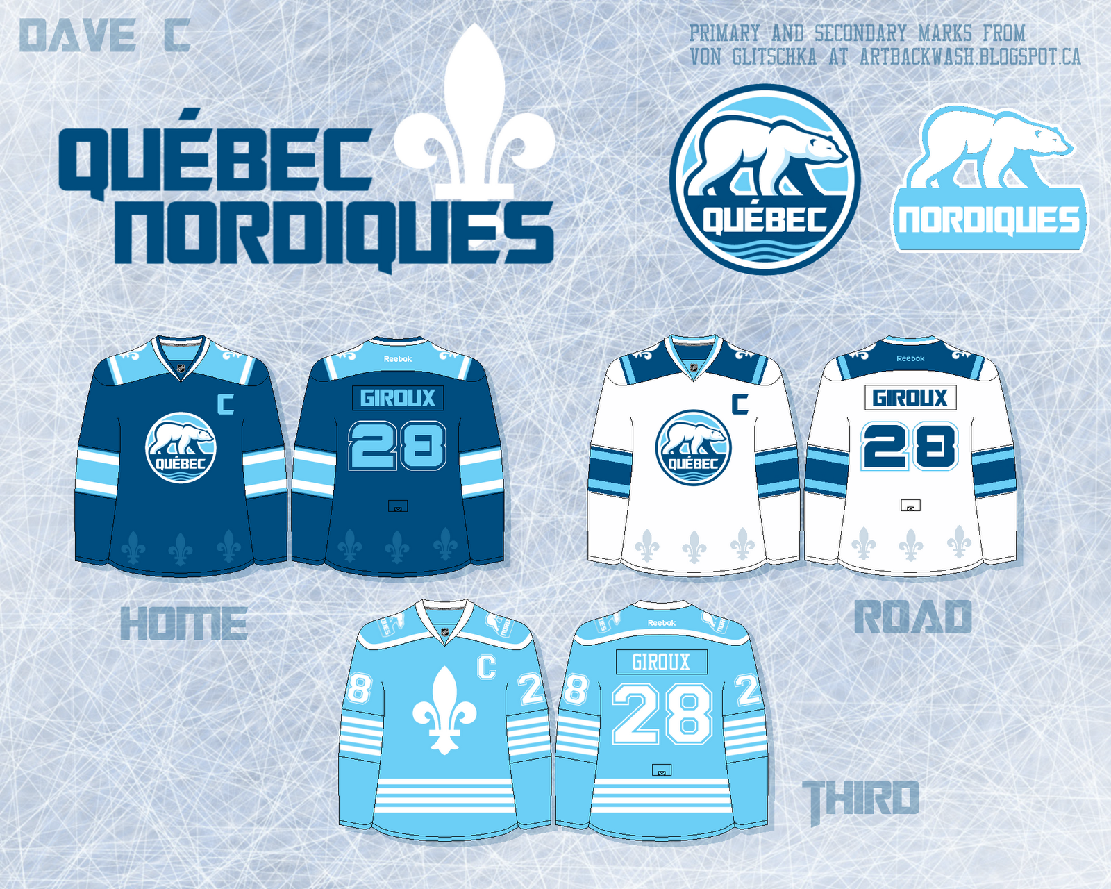
_________________________________________________________________________________

Quebec (Dave C.)


Hartford (Casey R.)

Quebec (Tyler G.)

_________________________________________________________________________________

Ottawa Senators (Dave C.)
This is really cool. The stripes are really think and show off the design which works out really well here. I also love that alternate logo with the gold trim. The font is kind of strange but it definitely says "Senators" to me. Or something Greek? Nevertheless, solid work here, Dave. 

Ottawa Senators (Dave C.)
I LOVE this! Dave got the striping perfect and he obviously knows which logo needs to be used. I personally prefer a red jersey but it seems that all Sens fans want black to be the base color again. If you transferred this onto the Reebok template and added shoulder patches this would be the perfect look for the Senators. Not much more to say here. Great work, Dave.

I'm really starting to love these yellow/gold Panthers jerseys! This is a great start by Casey. The striping looks great and would be a good match to the home and away jerseys. I think that the red cuffs and blue trim on the hem need to be removed though.  I would also go with (always) a solid colored helmet and in this case, all red pants. My last nitpick is that the socks have no stripes. Other than that I think this would make a great jersey! I would be interested to see some white in between the stripes to match that great logo. That's just my opinion though. Good work Casey and thanks for sending this in!

Buffalo Sabres (Tyler G.) 
I absolutely loved the Sabres anniversary jerseys and if I came across one in a store I would probably buy it.   Tyler did an excellent job combining the anniversary jerseys and the current jerseys. I would take these over the current or past Sabres jerseys any day!      

Dallas Stars (Tyler G.)
Another great set by Tyler. The yokes and stripes are cool. I love the way he used the colors. These are (obviously) a huge improvement over the current uniforms and wouldn't mind too see these in action. No complaints here. Two solid concepts Tyler.
_________________________________________________________________________________


Saturday, August 11, 2012

Bringing Black and Silver Back to Tampa Bay

Hello Everyone, it's late here in Colorado so I'm going to make it quick tonight. First off I have a Tampa Bay Lightning concept set.

Tampa Bay Lightning
I'll be honest. I love the Lightning's current look! Its simple, clean and effective. But a lot of people have been calling on the return of black. In my opinion, if the Lightning's current (maybe past?) third jersey lost the nickname it would be a great jersey! That's what I tried to do here while also changing it up a bit. The biggest change is that from hem stripes to side stripes similar to those on the Ducks and Isles third jerseys. I created my own logo based off of the current primary and added more details and colors. It took a lot of variations but I'm glad with how it turned out. The alternate is just a modified version of the current alt. and to top everything off I included a sublimated wordmark on the bottom back of each jersey. I'm sorry for the sloppy, jibber-jabber description but I'm really tired. I would love to hear everyone's thoughts on this design!

Also stay tuned tomorrow for some concepts and expansion entries from Casey R. and David C. Goodnight everybody! Or goodmorning?

Wednesday, August 8, 2012

What I think the Denver Cutthroats will look like

Courtesy DenverCutthroats.com
This past year it was announced that Denver and the CHL would be receiving a new hockey team. I, living in Colorado, was obviously exited to get a new semi-pro hockey team to go watch. Before any announcements were made there were already tons of rumors about the Cutthroats name. For those who don't know, the Cutthroat is the state fish. I didn't mind it too much. I actually thought it sounded pretty badass. However unless it's a shark, not many fish are "badass." But I remained optimistic. Especially when I heard the Denver graphic design company, Adrenalin, was working with the Cutthroats. Adrenalin is the same company that designed the Avalanche logos and the current Coyotes brand among some other great designs such as the Colorado Mammoth. But the Cutthroats logo didn't measure up to the others. In my opinion it was actually a 
 terrific idea. A fish coming out of a stylized D with water and mountains coming out of the outlines. Very creative. The only problem is how it came out. It looks like amateur logo straight out of the 90s. And the colors, which are good, just don't seem to work within the logo. Maybe if the fish wasn't so bland this would look better? I was hoping the logo would come out something similar to Ryan Muraro's Seattle Sockeyes logo as seen on Puck Drawn. Even the colors are the same (for the most part) followed by some awesome jerseys. I actually predicted that the logo, or alternate logo, would be a Colorado "C" with a fish leaping out of the bottom end. I tried to render that but I couldn't create a fish that I liked. But I did create an alternate (on the right) similar to the primary meant to be portrayed as a "name in circle" logo. Currently the only logo and only logo/design that has been released has been the primary logo with a wordmark. I'm hoping to see an alternate but only time will tell if that happens.           

Courtesy DenverCutthroats.com
On the Denver Cutthroats website there are various images, wallpapers. backgrounds, etc. that all use the same general design. They all have some basic stripes (from inside: teal/blue, white, red) with a green background. It got me thinking that these images maybe hinting at the upcoming Cutthroats uniforms. With that being said I did my best to render what I think we will all see Denver unveil before this October.


 The jersey design is a combination of all those things. I decided to do a dark version based off of the images I found. I used the same striping from the wallpaper and used my alternate logo as a shoulder patch. I also decided to use teal/blue equipment. This isn't the best or most creative design but I think it's certainly possible. What do you guys think?
Courtesy DenverCutthroats.com


While I was gathering images for this post I came across this on the Cutthroats web page. It is a rendering of what Denver's mascot, Gill, will look like. I was less interested in the mascot and more interested in the jersey he is wearing. It's really basic and downright boring in my opinion. Pretty out dated as well. What is it with the Cutthroats and the 1990's design connection? Although I do like the wordmark, it looks awful on the jersey. It also makes the logo way too small. I'm sure this is just a basic jersey rendering for mascot presentation purposes but it got me thinking... what if this is the jersey? I sure hope not. I know they're just a CHL team but they can do better than this. My favorite part of the mascot has to be the arms and legs! I didn't know fish had those? Haha kidding.


I know not a lot of you want to read about the Denver Cutthroats but I really appreciate you stopping by, hearing me rant and checking out my newest design. Come back soon.


FIN
(Fish Pun Intended)

Tuesday, August 7, 2012

5 More Expansion Entries!


I have 5 more expansion entries today. If you want to send anything in for the contest the deadline is the end of the day August 15th.
_________________________________________________________________________________

Seattle (Ryan at HJC)

Hamilton (Scott D.)

 Hartford (Scott D.)

Seattle (Justin/Myself)

 Quebec (Justin/Myself)

_________________________________________________________________________________

I also drew up this bracket to give an idea of how the competition will work.

_________________________________________________________________________________


Monday, August 6, 2012

HJC Jersey and Ricky's Expansion Entries

 
Happy Monday to everyone! Today, as everyday is, was a mail day. Which means my HJC Jersey arrived.

                                       
The jersey itself is awesome! The logos and striping look great and really pop on the black jersey. I kept debating on purchasing one a few months back but ultimately decided not to. The main reason I didn't purchase one was because it was sublimated. But after seeing the jersey in person, it looks really nice. I also designed the shoulder patch and did the vector version of the primary so it's cool to see my own work come to life. If you were also debating on getting a jersey or not I would have to say that it's worth the price! I believe they're $75 for a fully customized jersey. I would of liked to have my name/number but how can I complain about a free jersey? It's also a size XL where as I wear a medium but once again... it's free! Here's a few up close photos.
Shoulder Patch I designed                                          
Sublimation Detail
_________________________________________________________________________________


Ricky M. at Buffalo Nickel Graphics sent in four entries! Way to go, Ricky! If you haven't sent any in yet you can email them to me by the end of the day Aug. 15th.

Hartford (Ricky)


Hamilton/Ontario (Ricky)

Quebec (Ricky)

Seattle (Ricky)


Also just to give people an idea I drew up this bracket to show how the tournament will work.

_________________________________________________________________________________

Thursday, August 2, 2012

First Expansion Entries (Deadline Extended)

_________________________________________________________________________________

Columbus Blue Jackets

First off I have a CBJ concept. The first thing I wanted to do was add more blue. After all they are the BLUE Jackets. I also wanted to add gold to the color scheme as a few others have. I think it compliments the blues and white very well. I also wanted to use the cannon logo as the primary. It's not a great logo but it represents the brand very nicely. You may have seen a proposed logo the Blue Jackets created (rendered by Avi S.) in the past. I created a more simplistic version of that logo for a shoulder patch. Lastly I added stars to the cuffs and few few minute datails to top off the jersey. This, in my opinion, is the direction the Blue Jackets need to take. I would really appreciate any feedback you have. I may creat a road white jersey sometime soon.
_________________________________________________________________________________

Next up is the NHL Expansion Contest! First off I wanted to let everyone know that the entry deadline has been extended until August 15th. I also have the first three entries!

Quebec (Scott D.)

Seattle (Scott D.)


 Hamilton (Myself/Justin)


I would love for everyone to participate so get your entries in and spread the word!
_________________________________________________________________________________

Tournament of Hockey Design

The second round of the TOHD rounded up with the Senators earning Best Third Jersey and the Avalanche (*sigh* but no suprise) getting crowned Worst Uniforms. Two new votes have been listed on the right side of the page.