After Minnesota and Buffalo released their third jerseys I always thought a cursive type word mark would look good for the Quebec Nordiques. I finally created a decent one and based the jersey design on their old powder blue ones. This is intended more as a third jersey and I am currently working on a home and away set to go along with it.
Arizona State University has been a college I've been interested in for a while and I wanted to create a Division 1 Hockey identity for them. I went a bit outside of my comfort zone but I think their logos and colors make it work. There is a detailed description on the image.
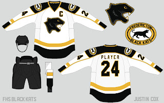
This is a concept for the Fredericton High school Black Kats. I'm not a great logo designer but they came out alright. What do you think?
A Buffalo Sabres set I created a while back. I made a mash up logo and created a new twist on their current jerseys.
I used to create a lot of custom NHL video game covers and plan on doing it again. Here are a few I have done in the past. If you would like me to make you one just leave a comment on this post!
I would love to hear your thoughts so comment about the concepts, covers and blog!


Those are some great concepts, especially that Quebec one! The blog looks great as well. I'll definitely be looking forward to future posts and concepts. Great work (as always) Justin!
ReplyDeleteThanks, NB14! I really like your work as well. I tried to check out your blog but it said it was removed?
DeleteYes, I changed my blog to www.nb14jerseyconcepts.blogspot.ca
DeleteHello, an amazing Information dude. Thanks for sharing this nice information with us. Wrestling Singlets
ReplyDelete