
package!
________________________________________________________________________
Logos
 |
| Inaugural Season Patch |
I wanted to do something a little different for this inaugural logo. Quebec has been (still is) waiting for pro hockey to return. That is what this logo represents with that being written in both English and French, surrounding the Quebec flag. Also, I had the return season be 2013-2014 for my concepts.
 |
| Primary |
 |
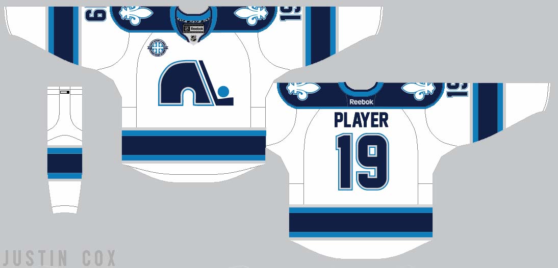
| Primary 2 (Home Jersey) |
The old Nordiques logo is classic and fans would be divistated if it didn't return. I brought it back in a new way. Powder blue and white were kept but red was replaced with navy blue and silver to create a new, modern twist on the old identity.
 |
| Third Jersey Primary |
 |
| Home/Away Shoulder Patch |
 |
| Third Jersey Shoulder Patch |
The Fleur de Lis is a symbol of Quebec and will remain on all three jerseys....
____________________________________________________________________________
Jerseys
.....and all of the logos come together on the jerseys and a new identity is born for the Nordiques!

____________________________________________________________________________
I would love to hear your input and feedback on this set! So please comment below. -Justin
____________________________________________________________________________
UPDATE
Steven G. pointed out that the away jersey had a lack of powder blue. I agree so for a quick fix, I switched the silver and powder blue on the striping. Which do you like better?
 |
| Updated Away Jersey |
I love these, espescially with that collar on the home and roads! Also, keep up the great logo designing! If you want, you can send some of your work to be posted at my blog at nb14jerseyconcepts@hotmail.com. I would be honoured to post your work. And congrats on winning the Super Series comp!
ReplyDeleteThanks! I really appreciate it! I definitely send some in soon. After I get my blog going a little better I'll start posting some others work. When I get to the point, I'll let you know so you can send in some concepts!
DeleteAll of the logos are great, but I think the uniforms could be improved. There is quite a bit of powder blue on the home jersey, but the road jersey has very little. I think it would be better if the road jersey had more powder blue.
ReplyDeleteI agree. I did a quick fix in the away jersey for now. You can see that above. Thanks for the feedback!
DeleteIf you're going to be in the HJC Open, consider submitting these! Great use of the "new colors" for sure!
ReplyDeleteThanks Ricky! I am planning on using it.
DeleteAlso, I haven't gotten much feedback on on the third jersey. How do you guys feel about it?
I really like the classic and simple feel to the third jersey. I like the wordmark and the simple striping pattern. The fleur de lis shoulder patches might make too many fleur de lis, but overall great work.
ReplyDeleteLooks good with more powder blue.
ReplyDeleteWhat a design.. Fantastic..
ReplyDeleteweb designing company in Toronto