Showing posts with label Nordiques. Show all posts

Monday, July 23, 2012

HJC Open Champion! Tournament Recap

_________________________________________________________________________________
If you haven't seen yet, I just recently won the HJC Open! First off, I would like to thank everyone who supported and voted me through any of the four rounds. I would also like to congratulate all of the other participants and thank them for putting up a good fight! One more than others... Stephane Sinotte! I didn't think I had a chance to win against Stephane but I got through the last round! Congrats Stephane and thanks for making me sweat this one out! I know the 3rd time will be a charm for you!

_________________________________________________________________________________
With the closing of the Open I also wanted to take a look back at my concepts throughout the tournament. Since I've already shared most of these concepts I'll keep the descriptions short.

Quebec Nordiques

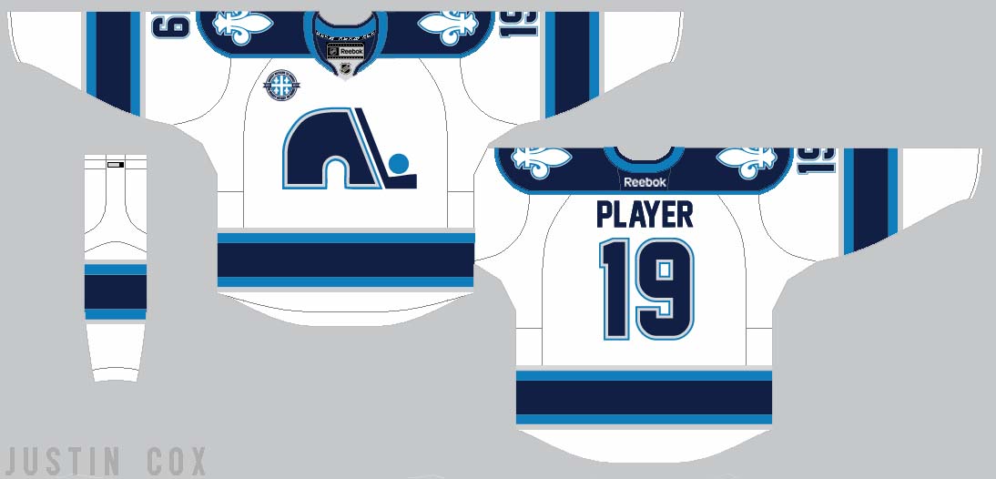
This was my first round entry... A Quebec Nordiques (third jersey) concept. Already in the first round I had a tough test against Kevin D. but ended up prevailing.

Colorado Avalanche 
 In the second round I had to go up against Dylan Alexander who always has top notch concepts. Luckily these Avs concepts pushed me into the third round.


Philadelphia Flyers

 I was really nervous when I saw that I would have to face off against Tex next. He always has beautiful concepts and submitted an awesome Jets concept for the third round. However my Flyers fauxback earned me a spot in the finals!

2013 Winter Classic

The final round I was facing... Stephane... Stephane the great! At the time I was just finishing up these Winter Classic jerseys and logos so I decided to use it. Stephane was the toughest competitor but I somehow prevailed and earned the titele... HJC Open Champion! I'll be posting a Winter Classic package soon with some changes and additions!
_________________________________________________________________________________

Thanks for stopping by! Expect another post tomorrow or Wednesday for a few Pacific Division rebrands!


Monday, June 25, 2012

Islanders + Revamped Concepts

Sorry there hasn't been a post for a while. I've got one new concept today as well as some revamped ones.

I've used illustrator for a little while but never had a template I liked. I finally got one! So that is the main reason I am uploading these old concepts. Honestly, I think the template alone improves all of them.

_________________________________________________________________________________

New York Islanders

I think we can all agree that the Isles current third jersey is awful. I wanted to base this off of their four stripe pattern that represents their cup victories. I'm not that great of a logo designer but I put together one that really ties is an "island" or "nautical" theme. I couldn't create a decent light house logo so I brrowed one from King Creative Design. For the shoulder patches I used a simplified "NY" mark.
Version 2

I didn't think my logo came out too great so I also made one with the regular primary logo and anchor shoulder patches. Which version do you like better?


Philadelphia Flyers Fauxback

I made a few small changes but I think the template really improves this one.


Quebec Nordiques


Washington Capitals


Colorado Avalanche
You may have seen this but I really want to know what people think. Is this a good fix for the Avs?

Vancouver Canucks


I changed the striping up to create a more unique look.


_________________________________________________________________________________

I'm considering entering some of these in the HJC Open (depending on how far I make it). I was wondering which ones you like best, or which ones I could possibly use? 

Thanks for reading!


Tuesday, June 19, 2012

The Nordiques Return to Quebec!

The Nordiques are returning to Quebec! Well, no they aren't yet. But I have made a fantasy concept as if they were! Yesterday I shared an inaugural season logo that I created. Here is the rest of my Nordiques
package!

________________________________________________________________________

Logos

Inaugural Season Patch
 I wanted to do something a little different for this inaugural logo. Quebec has been (still is) waiting for pro hockey to return. That is what this logo represents with that being written in both English and French, surrounding the Quebec flag. Also, I had the return season be 2013-2014 for my concepts.
Primary
Primary 2 (Home Jersey) 
 The old Nordiques logo is classic and fans would be divistated if it didn't return. I brought it back in a new way. Powder blue and white were kept but red was replaced with navy blue and silver to create a new, modern twist on the old identity.


Third Jersey Primary
A third jersey was added in the first season and would be modeled after the former powder blue jerseys with one exception. It waould dawn a French-Styled "Quebec" workmark on the front.


Home/Away Shoulder Patch
Third  Jersey Shoulder Patch

The Fleur de Lis is a symbol of Quebec and will remain on all three jerseys....

____________________________________________________________________________

Jerseys

.....and all of the logos come together on the jerseys and a new identity is born for the Nordiques!


____________________________________________________________________________

I would love to hear your input and feedback on this set! So please comment below.  -Justin

____________________________________________________________________________

UPDATE

Steven G. pointed out that the away jersey had a lack of powder blue. I agree so for a quick fix, I switched the silver and powder blue on the striping. Which do you like better?

Updated Away Jersey


Monday, June 18, 2012

Preview: Hockey Returns to Quebec!

Hockey returns to Quebec! Well, kind of. This is just a sneak preview to my new Quebec Nordiques concept. I hope to have it up in the next couple of days! Until then, enjoy.


Saturday, June 16, 2012

Concepts and Covers

Hello, and once again, welcome to the Art of Hockey! Today I have a few new concepts as well as some custom NHL video game covers. I would love to get some comments about my concept as well as the blog.


After Minnesota and Buffalo released their third jerseys I always thought a cursive type word mark would look good for the Quebec Nordiques. I finally created a decent one and based the jersey design on their old powder blue ones. This is intended more as a third jersey and I am currently working on a home and away set to go along with it.


Arizona State University has been a college I've been interested in for a while and I wanted to create a Division 1 Hockey identity for them. I went a bit outside of my comfort zone but I think their logos and colors make it work. There is a detailed description on the image.


This is a concept for the Fredericton High school Black Kats. I'm not a great logo designer but they came out alright. What do you think?


A Buffalo Sabres set I created a while back. I made a mash up logo and created a new twist on their current jerseys.

I used to create a lot of custom NHL video game covers and plan on doing it again. Here are a few I have done in the past. If you would like me to make you one just leave a comment on this post!


I would love to hear your thoughts so comment about the concepts, covers and blog!